MCS Logo Change Details
“Cubby” Not Set To Change
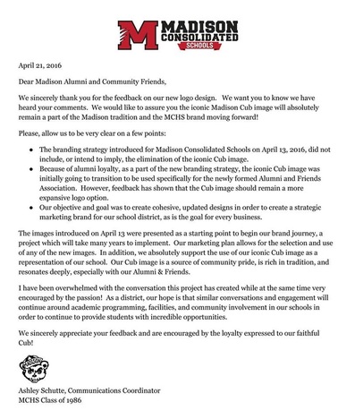
August 22, 2016
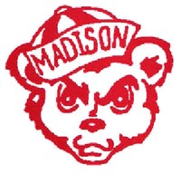
The new Madison Consolidated High School Cubs logo has sparked debate in the community recently. The new logo caused many people to speak out about how the original cub logo was special to them. MCS Communications Coordinator Ashley Schutte said, “By changing the logo, we were trying to unite all the schools under one official image. We were hoping by doing this we would begin to create an image of our schools that was positive within our community and surrounding areas.”
The logo committee consisted of seven various members of MCS administration and qualified individuals including Schutte, Dr. Ginger Studebaker-Bolinger, Dr. Katie Jenner, Athletic Director Cliff Hawkins, Board President Joyce Imel, Coach Patric Morrison, and former PTO member and parent of an alumnus Carri Dirksen. According to Schutte, the idea was to find a consistent logo that looked professional and polished.
One original idea for the logo change was the desire to consolidate and unify the logos among the various schools throughout the district. This strategy would provide an opportunity to trademark the logo so chains and retail stores are unable to piggyback profits from the school district. The color scheme was intended to create a sense of unity as well. The inspiration was taken from the Fine Arts Academy, according to Schutte.
The logo design was created by Quantum Communications. Quantum Communications is a Louisville-based company owned by Linda Schuster and was a comfortable choice for Schutte. “I’ve known (Schuster) for 25 years,” said Schutte.
Another reason for the use of Quantum Communications is their experience in web design. According to Schutte, the company would have provided a solid base not only for the logo but in the school’s web design, an area that needs an upgrade, according to Schutte.
In addition to the unveiling of the controversial logo, there were also two letter M logos that were revealed as well. There was a distinctive red letter M with claw marks taken from the left side, and there was also a black M with a paw print in the background.
The discussion of the logo has made an impact on the community. A passionate response from the community has allowed the committee to rethink their decision. The committee has now decided to stay with the original cub design.